
Defining values, decoding colours: the Consilium brand story
Clients, friends and interested observers will have noticed some changes at Consilium Chartered Accountants recently. A refreshed brand identity, website and offices are a few of the more significant updates to have taken place in 2023. Now, as the year comes to a close, we wanted to share the story behind the changes and answer the question on everyone’s lips: why did you pick those colours?
Start-up priorities
When forming a start-up, a coherent brand strategy can be pretty far down the to-do list, as partner Linzi Wilson explains: “To be honest, we just needed something to go on the letterheads!”
“Getting the business up and running and able to provide the level of service we envisaged monopolised our time. Thinking about how our vision could be represented was always on the back burner.”
While the logotype may have been hastily created, the values and vision underpinning the company were mapped out.
“We wanted to do something different”, says Linzi. “To be a company that was committed to supporting people to achieve their goals. The goals of owner-managed businesses, entrepreneurs, our colleagues and ourselves.”
Defining Consilium: four core values
Fast forward through a whirlwind nine years and Consilium had progressed from a small start-up to a 50-plus team of accountants, business advisors and tax specialists. While the vision remained, the business had evolved and the culture similarly so. It was time for a refresh that would capture the essence of the firm.
“We created a values group, made up of colleagues from across the business and at all levels”, explains Linzi. “The partners worked with the group to try and summarise what it meant to ‘Be Consilium’ after nearly ten years as a firm of chartered accountants and business advisers.”

The Consilium Values team (clockwise from top left): Duncan McKellar, Beth Goodwin, Stuart Todd, Andrew McKay, Lydia Jagger and Kirsty Boal.
Here Duncan McKellar, the chair of the values group, takes up the story: “Through conversations with colleagues it was clear that the values of the company culture could be distilled down to four themes: advice; integrity; teamwork and progressive. Those were the ideas that defined how we do our work and, ultimately, what is required to be a member of the Consilium team.”
Decoding the palette: the meaning behind the colours
With Consilium’s vision and values captured, the next step was to reconsider the company’s visual identity and corporate branding.
Consilium engaged Davinder Samrai of Freight Design to take the ‘back of a napkin’ brand, as such, and turn it into something reflective of the journey so far and the one still to come.
“Working closely with Linzi and the other partners, there was a foundation already there in terms of the core brand colours. Combining dark and gold branding for an accountancy firm is a meaningful choice”, explains Davinder. “The very dark blue – technically, it isn’t black – conveys professionalism, integrity, and stability, which are essential qualities for an accountancy firm, and reflect Consilium’s values.”
“The gold brings energy and the desire for excellence to the brand. It represents the high standards Consilium’s clients expect and the drive for innovation that is part of the firm’s core values. It also adds a touch of vibrancy and visual interest.”
“It was then a question of how we could develop that into brand elements that would communicate those themes and values.”
How do you visualise accountancy?
Part of the solution was the development of a bespoke suite of icons to illustrate everything from the professional services offered by Consilium, to the values of the brand and the company’s aspirations.
“Visually, it can be tough to represent the different areas of expertise and skills offered by chartered accountants. With so much of what they do being digital, visual representations of their services and values are challenging to execute”, describes Davinder.
“Photography can only do so much before it becomes just a series of generic images. In creating the suite of icons, we were able to create something individual to the brand.”
Pillars of significance and tailored creatives
This individuality extended into the next aspect of the project: introducing the revised brand to Consilium’s Glasgow offices. Instead of simply throwing some graphics onto previously bare walls, a more deliberate approach was taken.
“We chose to wrap the pillars within the office space in our core values”, says Linzi. “They are the cornerstone of our business and reinforce their significance in upholding our brand and what it means to Be Consilium.”
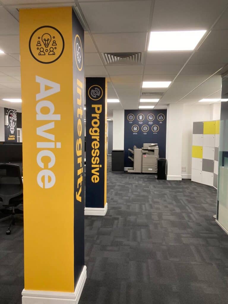
Creatives were also tailored to each of the company’s meeting rooms and working spaces. The aim is to inspire the adoption of the company’s values every day. “For example, being progressive goes beyond Consilium simply embracing new technologies”, describes Linzi. “it’s about asking how we can make our services and our processes better each time.”
The story so far…
The transformation of the Consilium brand is more than just a visual facelift; it’s a strategic move that aligns with the company’s journey from start-up to thriving business. It’s a statement of the unwavering values that define Consilium Chartered Accountants – past, present and future.
Connect with Consilium Chartered Accountants on LinkedIn, Twitter, Instagram and YouTube.